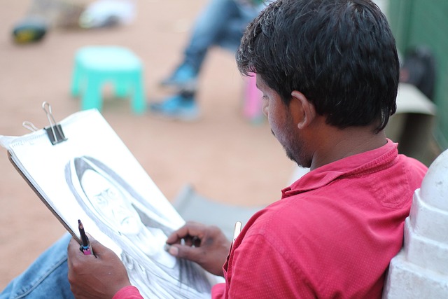
In the quiet glow of an artist’s studio, the humble graphite pencil often becomes a portal to a world where light, shadow, and texture are translated into lines and shades. For fine artists who seek a faithful reproduction of reality or a deliberate stylized rendition, the concept of pencil matching is a foundational skill. It involves selecting the appropriate hardness, composition, and brand to achieve the desired tonal range and longevity of the drawing. While many aspiring illustrators assume that any pencil will do, a nuanced understanding of pencil matching can elevate a sketch from a mere outline to a compelling visual narrative.
The Evolution of Graphite and the Rise of Pencil Matching
Graphite, a naturally occurring carbon mineral, was first used in drawing tools during the 16th century. The early artists relied on graphite mixed with clay to produce pencils with varying degrees of hardness, measured on a scale from 9B (softest) to 9H (hardest). Over time, manufacturers refined the blend, introduced additional binders, and standardized the grading system, giving artists a predictable framework for pencil matching. This historical trajectory shows that what seems like a simple tool is, in fact, a product of centuries of experimentation and scientific inquiry.
When artists today discuss pencil matching, they are not only referencing the graphite-to-clay ratio but also considering factors such as grit size, filler content, and even the type of wood or composite sheath that houses the graphite core. The term has broadened to encompass the strategic choice of pencils that match the subject’s tonal complexity, the paper’s texture, and the artist’s own hand pressure.
Choosing the Right Pencil for Light and Shadow
Lighting is the lifeblood of any drawing. A subtle shift from bright highlights to deep shadows can transform a simple sketch into a dramatic composition. To manage this effectively, artists must match the pencil hardness to the desired tonal range.
“A softer pencil yields richer blacks and can create the depth necessary for atmospheric effects, while a harder pencil offers precise, controlled lines for crisp highlights.”
For example, a 2B pencil is ideal for mid-tones in portraits, whereas an 8B will capture the darkest recesses of a landscape. Conversely, an H grade such as 4H or 6H is indispensable for architectural drawings where clean, crisp lines are required.
Paper Compatibility and Pencil Matching
Even the most meticulously matched pencil can fail if the paper is incompatible. The paper’s texture—smooth, vellum, or rough—plays a decisive role in how the graphite interacts with the surface. Fine art practitioners often prefer paper with a slight tooth, such as Arches or Canson, which holds graphite without smudging.
When selecting a pencil, one must consider how the graphite will spread on the chosen substrate. Softer pencils on very smooth paper may produce a washed-out appearance, whereas harder pencils on rough paper might leave visible scratches. This interplay underscores the importance of pencil matching in the broader context of material harmony.
Advanced Techniques: Layering and Texture Creation
Mastering pencil matching enables artists to layer graphite seamlessly. By beginning with a light 6H stroke for the base, an artist can build up depth with progressively softer grades, ultimately achieving a natural gradation from light to dark. The technique of feathering—softening the graphite edge with a blending stump or a light touch—depends on having the correct pencil hardness.
- Sketching: Use a 4H pencil to outline major shapes. Its sharpness preserves fine details.
- Mid-tone construction: Transition to 2B or 4B to fill in form and volume.
- Deepening shadows: Finish with 6B or 8B, carefully layering to avoid crumbling.
Texture simulation, such as rendering fur or bark, requires a mix of pencil grades. A soft pencil can deposit a velvety stroke, while a harder pencil can create a scratchy, granular effect.
Preserving the Integrity of Your Drawing
Once the drawing is complete, the longevity of the graphite on paper becomes a concern. Pencil matching plays a role here, too. Pencils with a higher filler content tend to smudge more readily, so an artist might choose a lower filler, higher hardness pencil for areas that will be exposed to handling or display. Additionally, applying a light fixative can protect the graphite, but it is crucial to test the fixative on a small area first to avoid color shifts.
Artists working in mixed media may layer pencil over ink or watercolor. In such cases, pencil matching ensures that the graphite does not lift the underlying layers, maintaining the integrity of the composition.
Conclusion: The Artful Science of Pencil Matching
While pencil matching may appear to be a technical detail, it is a vital component of fine art drawing. It bridges the gap between the physical material and the artist’s expressive intent. By thoughtfully selecting the pencil hardness, composition, and brand in accordance with the paper, lighting, and subject matter, an artist can unlock a wide spectrum of tonal possibilities. The result is not merely a drawing, but a work that speaks to the viewer with depth, realism, and subtlety. In the ever-evolving world of fine arts, pencil matching remains a timeless skill that continues to shape how artists bring their visions to life.